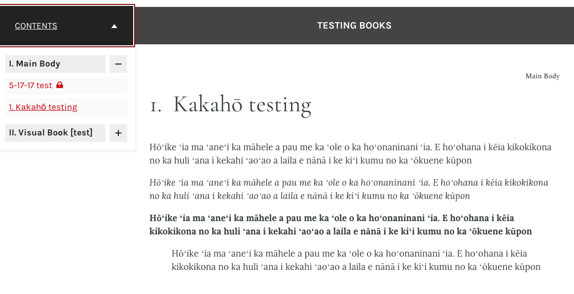
We are noticing that characters with kakahō (macrons) appear different than other characters in the text. It almost looks like they are bold, or in a different font.
Regular in-chapter content doesn’t appear this way, only the text styled as a heading I believe.
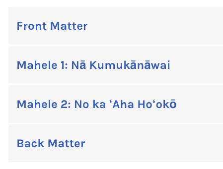
Examples:
and
Might this be a theme-based issue? I foresee more content using Hawaiian diacriticals in the near future, hoping to find the cleanest way to handle it now.
FYI This book uses the Open Textbooks theme Version: 2.1.1
We don’t maintain the Open Textbooks theme (that’s one of @brad’s creations at BCcampus), so it’s hard to say exactly. First debugging question I’d ask is if the problem persists in vanilla Pressbooks themes (like McLuhan or Luther)?
In the screenshot I posted, we’re using Lora as the typeface for the body text and Karla for the ToC test. I believe both are Google fonts. Karla appears to have a more limited character set (Karla - Google Fonts) than Lora does (Lora - Google Fonts). My suspicion is that what you’re seeing here is the browser displaying the unicode character for a character that doesn’t have a specified symbol included in the font kit in question. That’s my first, best guess as to why the macrons render differently in that example (and in our Open Textbook example).
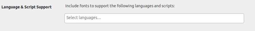
Hi all, the immediate issue is what @SteelWagstaff identified — the theme used for titling and TOC items in the webbook UI is Karla, which does not include kakahō. I think it would be good to add explicit support for Hawaiian in language & script support. However, this would only affect chapter/section titles and content and would not solve the issue @wmeinke is encountering. My inclination would be to expand the scope of language & script support so as to alter the fonts in the webbook UI as well. I think that needs a quick product discussion, so I’ll add it to our product team meeting agenda for Monday. Thanks for bringing this to our attention, as I expect it affects other languages & scripts as well!
@wmeinke I’m guessing you noticed this a long time ago, but Karla added a more complete glyphset to the font in 2019 (karla/FONTLOG.txt at main · googlefonts/karla · GitHub), which results in much better performance for kakahō and other Latin characters with diacritical markings. I think books and chapters should look good now, but let me know if you’ve noticed any other problems related to this?