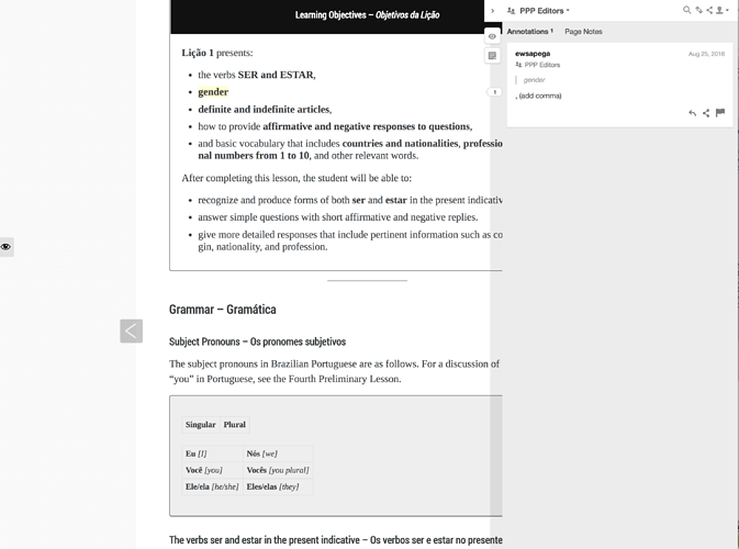
I have a styling question and recommendation for Pressbooks themes, to be implemented especially when books have the hypothes.is annotation plugin activated. The problem is that PB themes, while implemented a fixed max-width, also center the page with auto-margins. Normally, this is fine, but in many cases, when the annotation layer is turned on, the annotation expands from the right side of the browser and covers the text. For one example, see:
Notice in the example above that there’s still space on the left side of the content, space which could easily be occupied by content, leaving more space on the right for the annotation pane to expand. What would be the downside, for example, of, say, setting the margins on the #wrap element to 0 440px 60px 0; when the screen is wider than 940px? I realize that there would likely be knock-on effects for the previous/next buttons, etc. so I’m not proposing this as the solution, just as a proposal or idea that can hopefully get some conversation about how to implement or resolve this started.
