I’m just wondering if screen readers deal gracefully with PB textboxes .. and, for that matter, how they do so. Do they announce that the material is inside a container of some kind, and, if so, is the “type” of the textbox (“Examples”, “Key Takeaways” … those kinds of things – which are Theme-dependent, I think) is announced, too.
Most screenreaders don’t announce divs, even with verbosity set to high.
Different versions of Pressbooks have had different heading levels for the boxes at different times. Older books may have every textbox start with an H3. This would mean that if you were using those learning boxes structurally, your learning objectives, key takeaways, and exercises would show up in the “heading table of contents” if you asked your screenreader to announce headings.
The current markup for textboxes doesn’t use a heading level at all, and instead has a <heading> tag with a <p> for the label.
So for an older pressbooks book, boxes are marked and easy to find via the heading structure, but for a new pressbooks book, you would have to reinsert that structure in if it was important to you.
The boxes are made up of HTML, and that structure would remain even if you changed themes, although the colors and styling might be different from theme to theme. But it wouldn’t change the way its announced or how it “looks” to a screenreader.
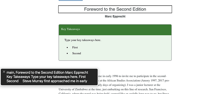
^Screenshot of VoiceOver on a Mac, the textbox is what the screenreader is saying.
That’s great – if I understand you, since all PB textboxes are just <div>s with a particular class selected, that is pretty much ignored by screenreaders. And if I always put some <hX> (where X is a small number) inside the textbox (either one of the “plain” textboxes without the <header> or one of those with a <header>), then it will be navigable as usual with assistive tech.
Thanks so much!
yes – that’s correct. You can replace the <p> element that Key Takeaways is wrapped in by default with the appropriate level heading element if you want them to be signposted consistently. The most important thing to consider for accessibility when applying headings is to use heading levels hierarchically and consistently: WebAIM: Semantic Structure: Regions, Headings, and Lists. That means that you shouldn’t pick a heading level based on appearance, but on semantic structure. H2s should all indicate the same level of document structure, and should be followed by H3s rather than H4s, etc.
