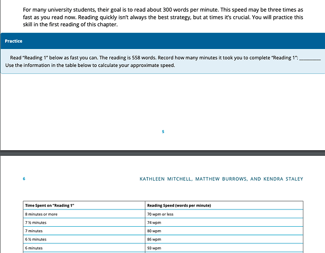
The font size in tables (and especially in tables within the “example textboxes” is very small. How can I make it larger and more accessible?
Hi @K_Mitch – the answer is probably going to be CSS (see this guide chapter: https://guide.pressbooks.com/chapter/customizing-your-exports-with-custom-styles/). There may be folks in the forum that’d be willing to offer specific ideas/suggestions if they had more details. Do you have a sample book that you can share that gives an idea of the problem (URL would be great, screenshots would be ok if link can’t be shared) and the name of the theme you’re using?
Thanks so much! Hopefully someone can give some insight. The theme is Andreessen. I figured out how to fix it individually for each table in the web version but I’d love a way to do it on the overall theme since this is a 250+ page book. Also, I realized my fix doesn’t work in the pdf (and probably e-book) exports. Basically in textboxes and tables I would like the theme NOT to shrink text. Here is a screenshot with small text in a textbox. My book is now published at https://universityreading.pressbooks.com/chapter/reading-1-introduction/ (but the web version now has correct sizing). My fix with the html did not carry over to the exports though. Any advice/code would be sooo helpful. I want to make sure the book is accessible. Screenshot:
Note: the screenshot above also illustrates the problem I posted in this thread about the margins in textboxes and pdf exports: Andreessen Theme Pdf Export
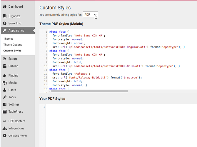
Thanks @K_Mitch – it looks like we have some unusual/buggy behavior in the Andreesen theme. We’ll look into this and try to get some bug tickets filed. In the meantime, you should be able to apply any CSS changes you made to the webbook to the ebook/PDFs separately by clicking those options from the dropdown menu in custom styles and pasting the relevant CSS.
I didn’t actually fix the table problem on the web version with CSS. Sometimes, I had to copy a table that worked from another page and replace the content so I don’t know how to fix it with CSS. Thoughts?

