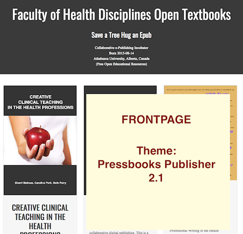
Our academic site uses Pressbooks Publisher 2.1 and the Open Textbooks 1.06
We wish to keep the same format for students because of the following reasons:
accessibility - less tapping = reduction in barriers to content
visual design - balance of white space and unobtrusive colors that enhance the content focus without creating visual noise and distraction
stable system
Will it be possible to upgrade to PB 5 without losing any of the current visual (i.e., form) and navigational (i.e., function) layout?
If you wish to use Pressbooks 5 you will need to update to the latest versions of both of these themes. Our work on Aldine (the new network theme) and McLuhan (the new webbook theme) have been supported by eCampus Ontario and should provide improvements in accessibility for users:
Table of contents and other complex controls are now accessible via keyboard navigation
All controls have been optimized for screen reader support
The reading width for desktops can be increased or decreased from Theme Options → Web
Colours can be customized (so, for example, I can make the interface monochrome to better align with Pressbooks Publisher 2.1’s aesthetic)
Furthermore, we are working with OCAD University’s Inclusive Design Research Centre over the next few months to review and further improve these new themes (and our dashboard interfaces) from an accessibility and inclusivity standpoint.
Pressbooks is a closely-connected ecosystem of plugins and themes, so it’s not really possible for us to make improvements to one part without making changes to another, and we can’t maintain older deprecated themes indefinitely. We hope you’ll consider upgrading to the new versions, and we welcome feedback on how we can make the themes more customizeable to meet your needs and your users’s needs.
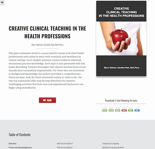
What made our current setup useful was that all the information was displayed without any drill-down or drop-down, and minimal tap. Only one tap to go from home to textbook page with online and offline options (second tap if not direct link to textbook). While the enlarge text button was a visual annoyance, it was manageable by forum suggestion to change position to top left corner. The enlarge text button was not useful on desktops and marginally on smartphone. Would prefer an option to disable.
I would agree that increasing the width of the text body is useful in filling the screen real-estate, in particular smartphone displays. Left/Right arrows could be less distracting if configurable to appear at top or lower 1/4 of page.
We look forward to the progress on future PB developments.
Thanks,
Cheers,
Steve