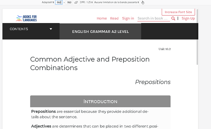
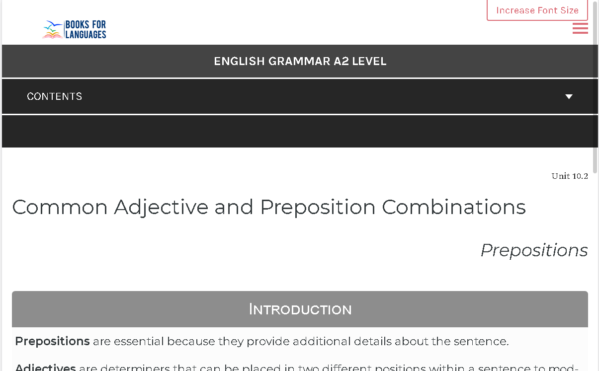
I want to modify the pressbook-book theme. I created a child theme and I made several modifications. I also modified the css, which is in book.css
I have a problem because I don’t want there to be any changes between 768px and 60 rem. So I would like to make the same settings that we create with @mediamedia screen and (min-width:60rem) but by putting in @media screen and (min-width:768px). But it doesn’t work.
For example it’s with 60 rem :
i want the same header and also the same size in the content with space in left and right. i think the line is
@media screen and (min-width:60rem) { #content { width: var(--reading-width, 40em) } }[SEE THE FIRST REPLY FOR THE PICTURE ]
I want to know if i can modify and have the parameter between tablette and scree of my computer.
Thanks

