There is likely a CSS trick to solve the following problem…
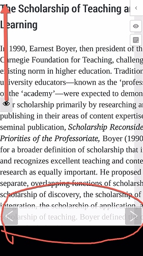
Problem definition as per illustration:
- the eye icon I would like only to appear at the top of the page (optionally not at all)
- the previous/next page arrors I would like to have appear at the bottom of the page
How can I do that?
Thanks, Steve
Hi Steve–the eye icon is placed in a class called .a11y-toolbar. On the theme I’m looking at that class has a top value set in CSS–it’s 43%, I believe. If you want it to appear at the top of your browser you could add the following to your custom CSS:
.a11y-toolbar { top: 0; }
That will move it universally. If you wanted to move it just for mobile devices, you could add a media and browser-width query – the sample code below should only be applied for browsers 500px wide or less:
@media only screen and (max-width: 500px) { .a11y-toolbar { top: 0; } }
I’m not sure if I understand your request #2. Aren’t these arrows in a fixed position at the bottom of your page already?
Thanks
I tried .a11y-toolbar { top: 0; }
in a book > Appearance > customize styles > Your Styles >
but no change.
The arrows appear at the launch of a page, rather than near the end. In addition the arrows do not go away, once they appear. WPFront Scroll Top plugin has a nice way of allowing a function to appear at a specific location and disappear when not in use. This could be helpful for navigational icons in PB.
Hi Steve,
I tried the same thing, and got the same results. It appears that the css for the a11y toolbar is being applied AFTER the custom themes css. I’m not sure about how enqueuing for themes works here or what’s happening exactly, but a quick and dirty hack would be simply to include an additional class to the CSS selector. For example, insert this CSS declaration:
body .a11y-toolbar { top: 0; }
and you should see the eye leap to the top left of the page.
As for the forward & next buttons, I’m not exactly sure what you’re hoping to achieve. Are you requesting that they disappear and appear based on scrolling behavior; something like what’s described here: https://medium.com/@mariusc23/hide-header-on-scroll-down-show-on-scroll-up-67bbaae9a78c? Or are you asking that they be anchored at the bottom of the page in a fixed position? Or something else entirely?
Thanks
body .a11y-toolbar { top: 0; }
is much better and less distracting to the body of information.
Less background noise. Now if it would disappear on scroll/swipe down that would keep the screen clean of function artifacts…and/or a disable flag in PB.
As for your link, that is the description that fits with my expectation of UI experience for the arrows.
Thanks,
Cheers,
Steve
Ok. Good news and bad for this request. Bad news is that I don’t think you can make elements disappear on scrolling purely with CSS. Good news is that it can be done with some relatively simple Javascript–here’s an example of a pretty simple method using jquery: https://stackoverflow.com/questions/20632943/how-can-i-make-a-div-disappear-when-scrolling-down-100px-from-the-top. In order to make this work with Pressbooks, I’m guessing you’d probably either want to a) make it a feature request and convince the owners of the core project that it’s worth implementing or b) write your own functionality plugin to inject the javascript you want.
I should caveat this by saying that I’m just a fellow PB user like you, so this is just peer-to-peer advice. There are more knowledgeable folks in this community here that might have better ideas/suggestions. Don’t take my word as gospel, in other words!
Thanks for the information.
I think the WP customizer is where the enabling of function layers could be located, if not in a book site setting. The key features for me are a responsive display, with the least hinderances to the information (e.g., function layers, extra tapping). There should be a way to hide or remove the font enlarge icon across all books on a site. It would be interesting to have double tap text to enlarge or reduce rather than icons, as that would be more intuitive (unless that feature already exists across web browsers and devices).
Thanks,
steve
