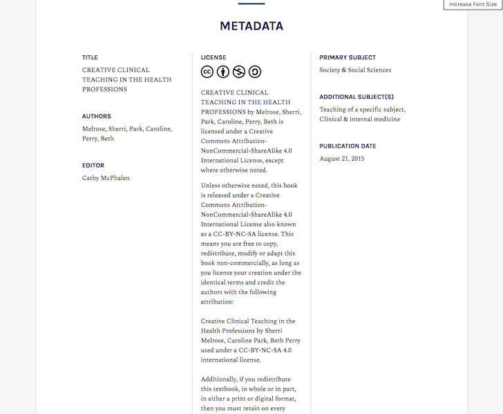
The default book site metadata layout is three column on desktop displays. The publisher and publication date would fit nicely under the title and authors, thereby shortening lengthy license information on desktop displays.
Can you share a screenshot?
If the number of characters move beyond certain limit, we can make them as collapsible with option appearing “more” and “less”,so that by default the design looks compact.
Why do you need three columns rather than two or single full width? Particularly when the majority of users now are engaging with smartphones not big desktop monitors? Why not one look for all (i.e., single column full with) ?
Single column full width does not work well with lots of metadata:

We opted for a responsive design, which is standard practice for modern web development that supports all devices well. Everyone’s metadata will be different, so we can’t make it perfect for every use case. The beauty of Pressbooks is that as open source software, if you are unhappy with the defaults, you can change them by modifying the web book theme’s source code.
1 Like
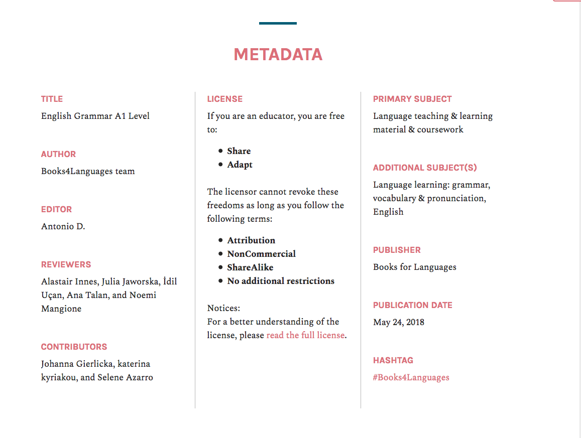
thanks for the demo, looks clean and consistent with scroll/swipe.
Which php file(s) in Aldine do I modify to change the Metadata section?
It’s in McLuhan:
However, you’d need to rebuild the CSS to see these changes and any of the customizations you make will be overwritten by updates to McLuhan. So I can’t provide support for this level of customization.